THE OVERKILL’S WALKING DEAD
GAME TYPE: 4 player co-operative FPS
Studio: Starbreeze Studios
Location: Stockhlom, sweden
My Role: UI/UX Design, 2D Art
Team size: 50-70 PEOPLE
Release Year: 2018
My Contributions on the Project
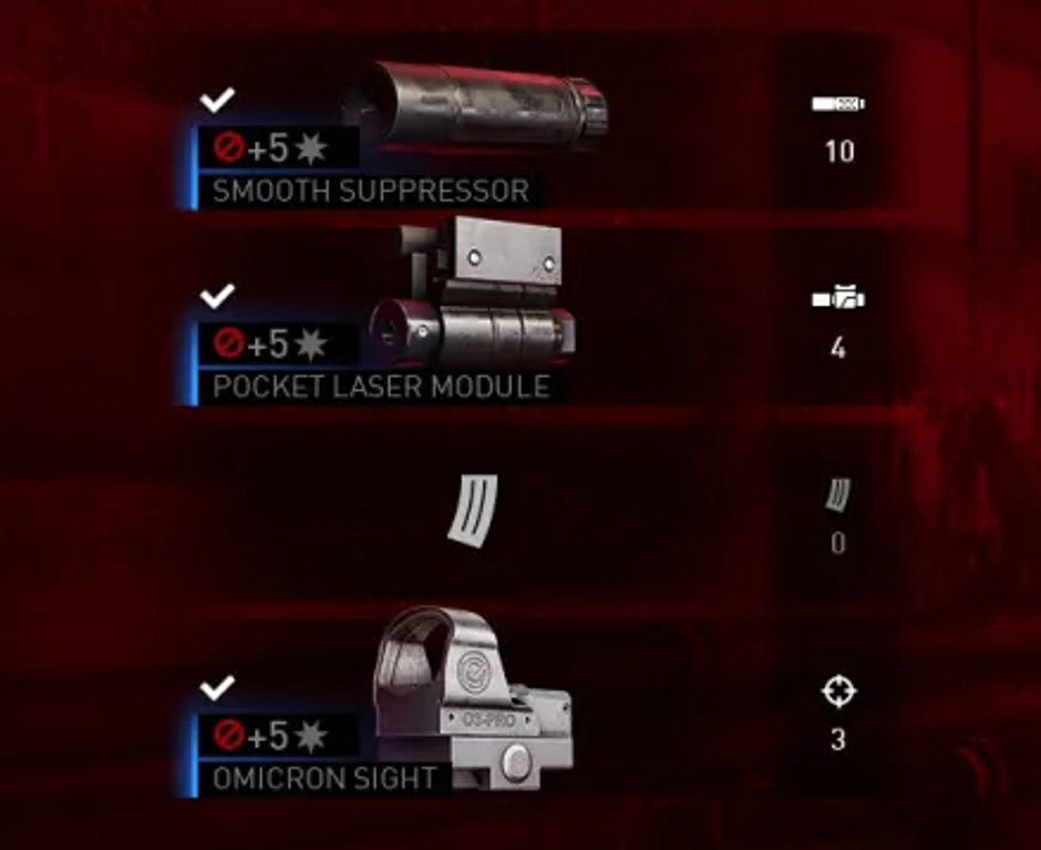
Designed the UI and interaction flow for post-mission reward screens featuring randomized weapon loot, rarity levels, stats, and modifiers.
Created mock-ups and clickable prototypes to explore reward reveal pacing and player decision-making.
Focused on making rewards feel more satisfying while keeping the information clear and easy to evaluate.
Iterated on inventory icons together with a senior artist, refining silhouettes, hierarchy, and readability.
Overkill’s - UX Case:
Designing Reward Flow
In Overkill’s The Walking Dead, players complete dangerous co-op missions and return to the post-mission flow to receive randomized loot and progression rewards. This reward moment needed to feel satisfying, readable, and motivating, while helping players quickly understand weapon rarity, stats, modifiers, and item value. My role was to define and design the reward screen UX, including the loot reveal flow, information hierarchy and interaction pacing.
The experience needed to balance emotional payoff with the progression loop. I worked closely with game designers, animation, programming, and environment art to shape the full reward scene from flow charts and wireframes to animated wireframes and final visual design mock-ups made with Photoshop.
The Challenge
I worked on the reward and loot reveal experience focused on improving how players received, understood, and emotionally connected with rewards after completing missions.
Post-mission rewards are a key emotional moment in progression-driven games. The existing experience lacked:
excitement during reward reveals
clear comparison between items
strong readability of rarity and stats
The goal was to create a reward flow that balanced excitement, clarity, and fast decision-making.
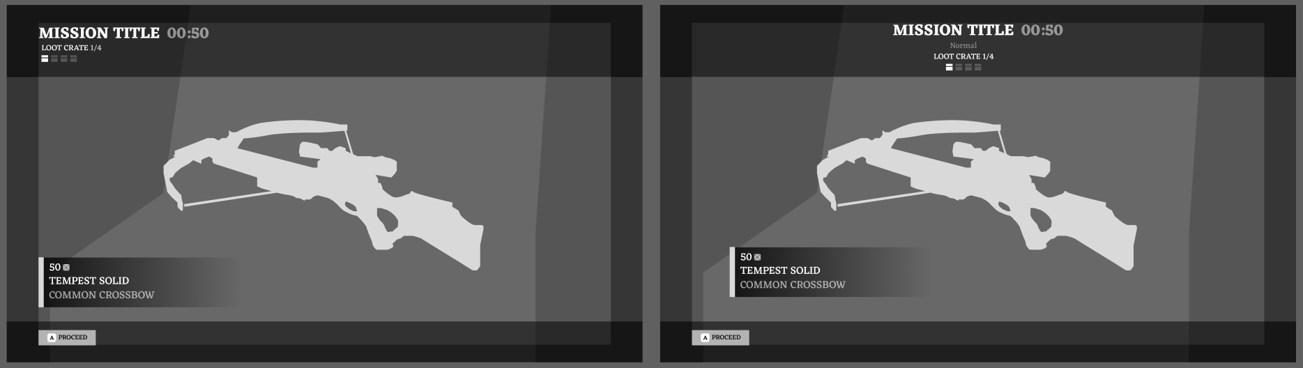
Iteration Comparisons.
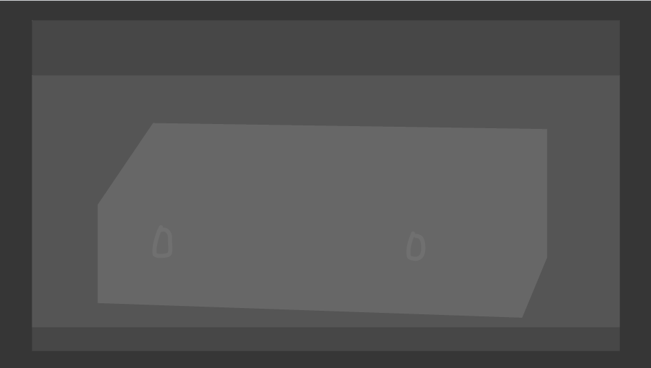
Weapon case opening. (Adobe XD)
Implementation
After defining the reward flow through wireframes and prototypes, I worked closely with an animator, programmer, and environment artist to bring the scene into the game. We were building it all with the unreal 4 camera and animation tools.
Together, we aligned UI timing, weapon presentation, camera framing, and environment staging so the reward reveal felt like a meaningful post-mission moment rather than a static results screen.
Outcome
The final design created a more rewarding and readable post-mission experience, helping players better understand progression and making rewards feel more impactful and satisfying.
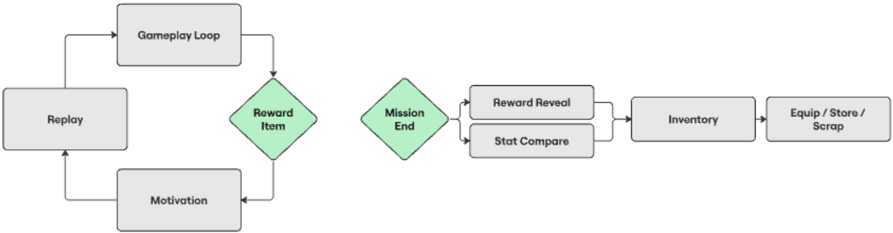
Collaborative diagram to align on UX intention.
Design Process
I worked closely with game designers to define the reward UX, starting with flow charts to map the full post-mission journey from mission completion to loot reveal and item evaluation.
From there, I created wireframes to establish structure, hierarchy, and player decision points, then developed animated wireframes to test pacing, reveal timing, and interaction flow.
Once the experience felt clear and satisfying, I created fully arted Photoshop mockups to define the final visual direction and presentation.
System Thinking
The reward experience was designed to support both emotional engagement and functional decision-making through
Mission Completion
→ Reward Reveal
→ Item Evaluation
→ Progression Motivation
→ Replay Incentive
The focus was not only on presenting rewards, but on reinforcing player motivation and long-term engagement.

Inventory Icon Iteration
Produced multiple iteration passes on the game’s inventory iconography with a senior artist, refining shapes, silhouettes, and visual hierarchy to ensure quick recognition during high-pressure game play scenarios.
Improved the consistency of the icon system to match the game’s gritty, survival-focused art direction.